TBF: Modeling NY40 Marilee, Weems & Plath magnifier & young Mr. Harding
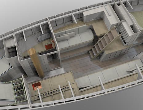 (Bits are back, if you know what I mean.) I skim a lot of email newsletters but this recent Stephens Waring Yacht Design creation brought the process to a quiet halt. I clicked up this image as big as possible and became mesmerized, and it later turned out that even the newsletter text is only a sketch of the bigger story. Before we get into that, I suggest you get mesmerized, and I snagged even higher resolution images. Clicking them big may be slow, but you should be getting yourself stilled and ready to simpy wonder...
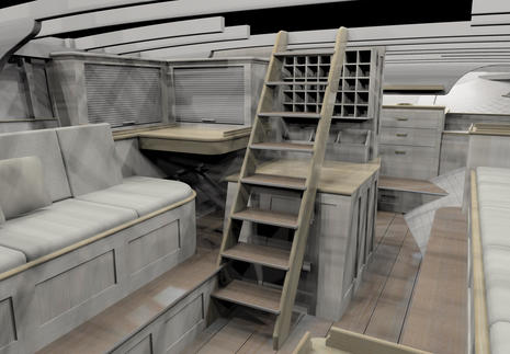 Wonder about the unusual grayish paneling? When further rendered from the virtual into the real world -- i.e. meatspace -- the goal is an "antiqued finish with built in patina" and the proposed solution is "a very washy, or pickled, white stain finish allowing the grain to show through." What kind of wood I don't yet know, but the varnished surfaces will be crafted from "old cypress logs that have been aged and stored under fresh water down south." And, yes, if you could actually raise those tambour doors, you would find a probably elaborate array of electronics ready to be used (but not otherwise seen).
In fact, the owner's desire for that nav station along with the couldn't-be-moved companionway ladder were the key challenges to achieving the "open, uncluttered" goal. Note how the designers jiu jitsued that challenge by stepping the settees up and outboard, yet still with comfortable seating and headroom. There's a lot of ergonomic thinking going on here, not easy when the original interior was built in the hair shirt era of yachting (well, if you check out Panbo's recent battery entry, you too may agree that "if it doesn't hurt, you're not doing right" boating culture is still with us).
But a whole lot had to happen before Paul Waring and Bob Stephens could strap and jack themselves into the huge workstations that dominate their classy, brick-clad design loft high above the small, Yankee hip port city of Belfast, Maine -- right, most of that is my imagination -- and dive into exotic software tools like Multisurf and Rhinoceros to virtually realize a design vision that required hours of lofty conversations, and possibly craft beer. Seriously, yesterday was the first time I ever heard the term "depth of character" applied a boat interior, and I totally got it.
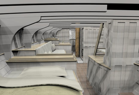 So at the beginning of this project, the 59-foot hull and deck of the 1926 New York 40 Marilee was digitally scanned and then every frame, floor, knee, deck beam and so on was painstakingly measured relative to the hull. Fortunately, Waring and Stephens can walk downhill to Marilee during her two-year restoration at French & Webb (though they might use wingsuits). At any rate, what we're really looking at in these renderings might be thought of as two levels of virtual. There's the precise representation of the hull "as-built" (plus 90 years) and then the imagined interior redesign. Both are integrated into a 3D wireframe that can then be skinned to create these amazing images. But the wireframe can also become blueprints, CNC machine scripts, and who knows what.
Come to think of it, couldn't this level of technology and expertise evolve into full scale holography at some point? The client-designer meetings could be spectacular: "Don't like the feel of this configuration"...poof..."Well, try walking around this one." After that it would just be a matter of boatbuilders with material checklists putting some meat into the desired wireframe (as if).
Obviously I'm carried away, especially since I mainly meant to tease the full entry possible after cruising to Belfast, visiting the two shops and presumably learning a lot about how to smartly accommodate modern electronics, systems, and humans into an absolutely gorgeous old racing boat. In the meantime, isn't it sweet that anyone can virtually wander inside the future classic 24/7/365. Personally, I like the floating pillows and the absence of stinky socks. Incidentally, if you're wondering about those odd-looking cyber sinks, in reality they are hammered copper creations brimming with character.
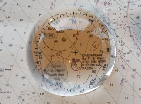 This Weems & Plath Crystal Magnifier was a valued companion as Gizmo and I worked our way from North Carolina to Maine last spring. Now it's on my desk, a nice reminder and still a very useful tool. This hefty 3-inch diameter jewell of optical-grade crystal glass designed to sit firmly and hands-free over what you're trying to see arguably works even better than it looks.
Thanks to the etched compass rose, the Magnifier can also be used for small navigation tasks. And these days, who doesn't enjoy being reminded of True North, perhaps the most straight-up reliable fact on our planet, and one we steadily spin around every every 23 hours, 56 minutes and 4 seconds with respect to the universe, even while so many other earthly and celestial phenomena are merely apparent, like when our globe's axis tilt appeared to disappear relative to the Sun this week. (Much more here about True North and why in my home the Vernal Equinox is also our anniversary.)
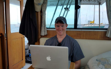
 Lastly, my friend Dan Harding's tale of our Gizmo slog from Essex, Connecticut, to Camden last June went online and out to PMY subscribers this week, and I've been hearing about it. (You can read Masters Degree here, note that these photos skew to the bright side, and there are more details here.) Truth be told, Dan could have cast the story along the lines of "curmudgeonly old geek anxious to get home, ocean mostly uncooperative," but he had a lot more fun. Some of it on me.
Dan also imparts some good advice about living with marine electronics. However, he couldn't report on what I was remembering about the subtle differences between a plenty good enough first time mate and a real gem. Like extra levels of awareness about what's going on and what's important, and a seemingly natural tendency to get even calmer when things go sideways, with a wickedly dry sense of humor a welcome bonus. The kid's got the stuff!
Finally, young Mr. Harding did not exaggerate how little we knew each other when we left the dock, and how fundamentally different that is now. I've concluded that his story is really about one of the best things that happens on boats. Thank you, Dan.

 Share
Share
Still stuck in 2D, I'm from the CAD - old school. I find the bulk of 3D renderings, gimmicks. But these detailed renderings, are very good!
They load instantly here in Rockport, thanks to our new town owned high speed fiber optics internet conduit.
The real value of the authenticity of these renderings could be extremely helpful for the designer and owner - during the design process - in more ways than one.
For instance, if you look at that raised settee - and the narrow step to sole - long and hard,... in this detailed program, it would be hard for me not to say, "Any other ideas on how to handle this?"
Fantastic tool! I'm on the fence on the wood finish.