
Lenny's interface testing, flawed?
... written for Panbo by Ben Ellison and posted on Nov 30, 2009

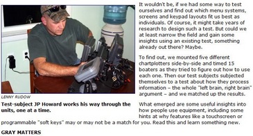
How does the old expression go..."He who giveth can also be an annoying butt?" Here's my problem: Last week Lenny Rudow wrote one of the most imaginative electronics pieces I've seen since, well, Lenny himself started flushing handhelds, but I think the premise is flawed. Before contemplating my two cents, though, please check out the article yourself, offered gratis by Mad Mariner...
Here's the thing: What Lenny tested was a user's first experience trying to perform some standard plotter moves using a particular interface. The problem is that a real user only has to do that once. What a shopper would really like to know, I think, is how easy and quick an interface is once you get familiar with it. And I don't think Lenny's testing, as ambitious as it was (hat's off, truly), really touches on this. The Garmin 640's middling scores are an an example. When Garmin first refreshed their whole line, and introduced touch screen in the process, I recall that it was extremely easy to accomplish a given task because the interface was extremely linear. But it was also darn tedious, and I joked once that we'd learn to recognize Garmin (non touch) users by their overdeveloped right thumbs!But when Garmin introduced the 600 series, it was also the first look at much more refined version of the linear interface that eventually spread to the whole line. A lot more controls were put under the context menu key, where you could get to them quicker, for instance. I like the new interface a lot better, and know plenty who agree, but it's probably a little more confusing for the first time user. Similar thing with soft keys, which scored badly in Lenny's test. Sorry, that doesn't indicate to me that softkeys are bad, but rather that the test was flawed. I've learned and used lots of plotters and MFDs and I almost always find well done soft keys to be useful reminders, as well short cuts, to what's possible. In fact, I too like the Lowrance HDS, which 'won' the testing, but I would advise buyers to step up to a size with soft keys if at all possible.
All that ends up with Lenny (who's blogging bigtime now) and I on opposite sides of the fence, but in a constructive sort of way I hope. Unfortunately I have no idea how to do a more relevant user interface test. I also have nothing to say about the left brain/right brain stuff, though I did take the test, and earned a near perfectly split 52/48 score. Does that make me a renaissance man or a dullard? Is Lenny's test a bit off, or is it me? Soft keys: yay or nay?
I don't know how objective these tests were, but I've long felt that the GUI for these plotters and MFDs are terrible. I have a Ray c80 for over 4 yrs now and still can't recall how to drill down in the menus and extract commands. Both my left and right brain can't learn this. I even resort to the manual at times and because the GUI is so dense I rarely use 95% of the capabilities.
Who designs this stuff and what were the criteria? I can say one thing the user interface in the units I have is not intuitive. I've tried at times for perhaps 1/2 hr or more to find something or try to display some data on a screen and simply give up.
How did this become so complex and byzantine?
As far as waypoint go I now place one and use the go to cursor. The data is repeated on cockpit displays which is where it's needed - sog, cog, dtw, ctw, ttg, xte.
In the cockpit I can follow the boat or see its heading on a Garmin PDA iQue which makes a pretty picture and if I want to steer by plotter I use the heading line to find the mark I want to steer to, of course checking that it doesn't take me into thin water or over submerged ledges.
Data over kill, let's go sailing.